
A shopping ad on Facebook or Instagram routes the shopper into a native commerce experience inside the app rather than out to the merchant's site. Which destination they receive, how it presents itself, and what it surfaces about the product are three distinct decisions made on every tap.
That decision was being made almost entirely by ad format. Nothing in it accounted for what the shopper was trying to do, what kind of merchant they had tapped, or what the catalog had in stock.
Move from one destination for everyone to a journey that adapts: how long the path is, what the destination looks like, and a way to tell which version is actually better.



-
High Level Strategy
Three projects, each deciding a different part of the same journey. The counterfactual carried no design work; it was an engineering and data science build. It belongs here because nothing else could be answered without it: it overrides where a slice of traffic gets sent, so the same traffic finally exists on both paths and can be compared directly.
Project What it decides Where it got to Abbreviated Journeys How long the journey is V2 shipped to a narrower segment Brand Templates What the destination looks like Ran as a learning test Counterfactual How we know which is better Now standing infrastructure -
My Role
The bet was deliberately broad; my job was to translate it into the concrete frameworks each one was built from, define what went into each, and design the surfaces that tested them.
- 01
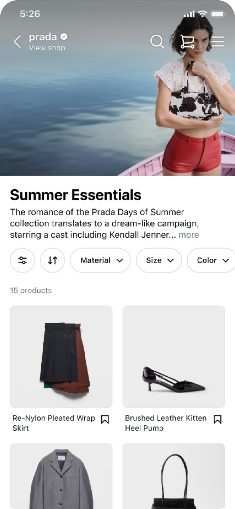
Defined and designed the seller archetypes Sincerity, excitement, competence, sophistication, and ruggedness. I defined how each would be represented in merchandising, and designed the two templates that went into the first experiment. Sophistication and Competence, because they sit at opposite ends of the same decision: whether to strip information away or add it.
- Sophistication editorial · curated · aspirational
- Prada
- Aesop
- Bottega
- Louis Vuitton
- Brand story first
- Lifestyle imagery
- Restrained type
Competence efficient · value · comparison- Walmart
- Amazon Basics
- Best Buy
- Target
- Product grid first
- High-contrast CTAs
- Comparison-optimized
- 02
Led alignment with the Facebook and Instagram design system teams Both directions required changes to core commerce formats, so neither could ship without the two design systems agreeing.
- 03
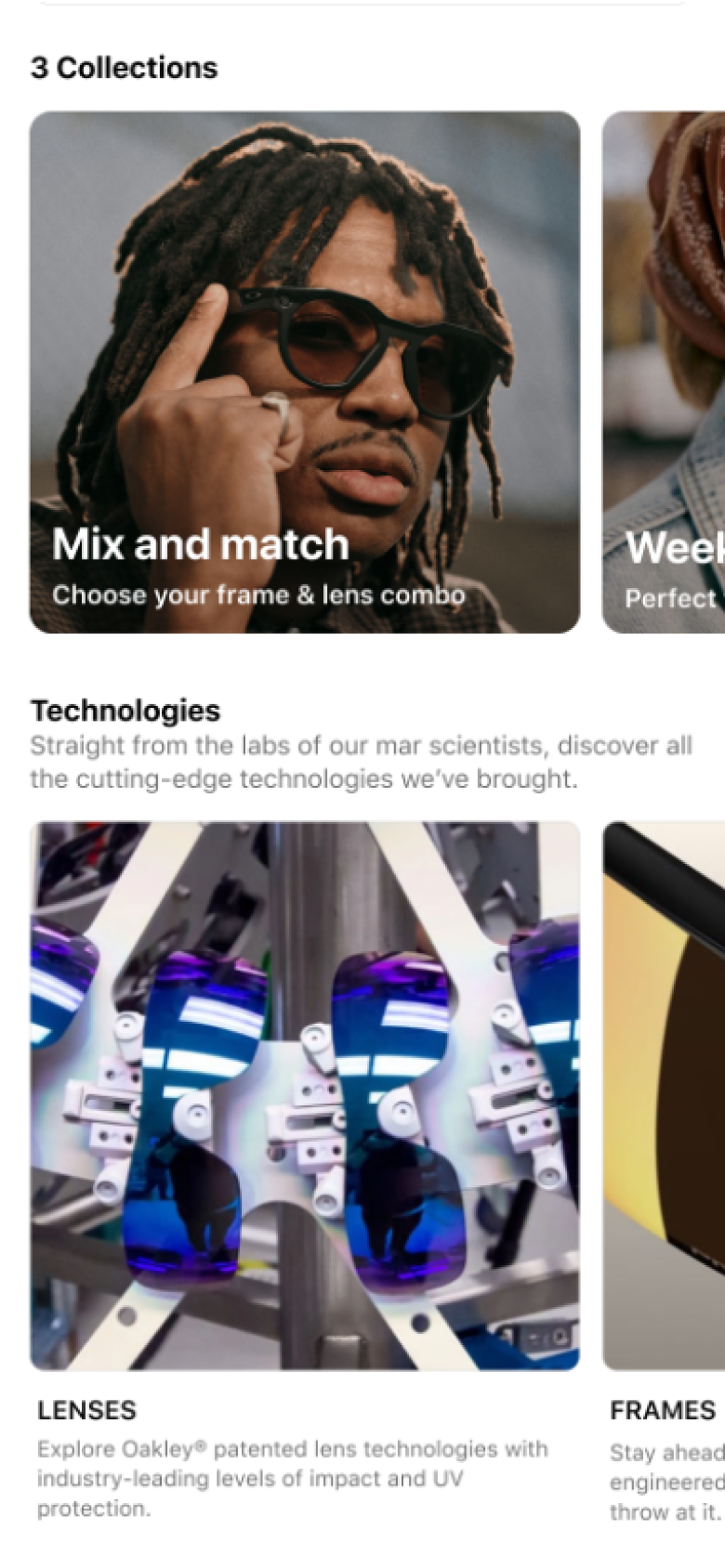
Broke the abbreviated journey into stages Three stages. The first handed the shopper off to the merchant's own site to browse, from the product tiles, the smallest change that still tests whether a shorter path helps. The second narrowed to the segment where it held. The third takes on the richer formats.
- 01
-
Brand Templates
Sophistication
Quality by subtraction: generous whitespace, lifestyle imagery, restrained type, brand story before grid.
CurrentCurrent ProposedProposed -
Brand Templates
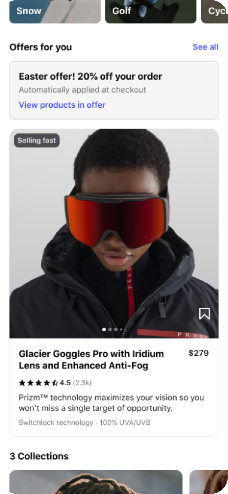
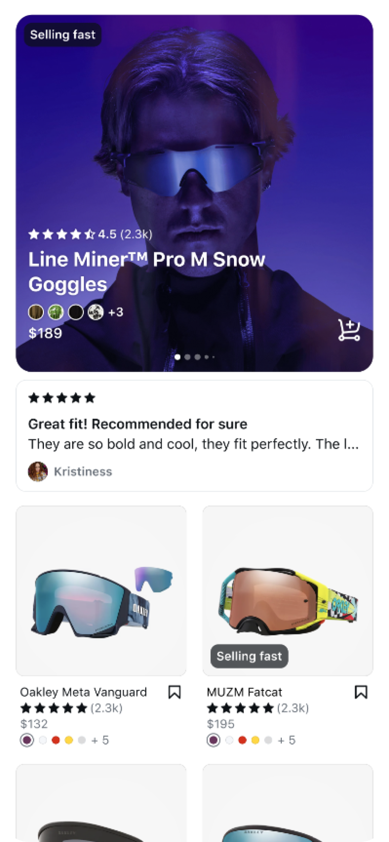
Competence
Breadth and proof: product grid, prominent deals, clear comparisons, high contrast calls to action.
CurrentCurrent ProposedProposed -
Abbreviated Journeys
The Shorter Path
What shipped, and what comes next. V1 hands the shopper to the merchant's site in the in-app browser. The bottom sheet keeps them in place instead, so the surface they came from stays behind it.
Shops to web browse, V1Shops to web browse, V1 Abbreviated shops to web browseAbbreviated shops to web browse -
Counterfactual
Testing Both Paths
Routing decided where every shopper went, so the two destinations were never tested on the same traffic. Any comparison between them was really comparing two different audiences. Forcing a slice of offsite-bound shoppers onsite anyway put the same kind of shopper on both paths, so the two could finally be compared fairly.
The problem fed itself: offsite won most of the traffic, so only offsite produced evidence, so the model sent even more there. Breaking that loop meant sending some shoppers to the path that performs worse on purpose, giving up a little revenue to find out what the other path would have done. It is now a permanent part of how the team tests, not a one-off study.
Without it- A shopper taps a shopping ad
- A model picks where they land
Offsite Almost always chosen, so we learn whether those shoppers converted.Onsite Rarely chosen, so we never learn how it would have done.Was onsite the better call? No way to know.
With it- A shopper taps a shopping ad
- A model picks where they land
Offsite We learn whether those shoppers converted.Onsite forced A slice is sent here regardless, so we learn how it does too.Same traffic, both paths. Finally comparable.
-
Outcome
Both projects became named investment areas for the following half. The journey work shipped to a targeted segment, with its impact measured at backtest rather than banked at launch. The merchandising work validated the direction and shaped where the team invested next.
-
Want the full story?
This page is a preview. The full case study covers the buyer segmentation framework, the archetype research and what it changed, the counterfactual experiment design, and the results in detail. Reach out and I'll walk you through it.